

Rebranding
Dirty Bird
I chose to rebrand Dirty Bird because I thought the current logo was doing a bit too much.
Between the bright red, the script, the crosses, and the chicken head, it feels cluttered and a bit dated.
Dirty Bird has such a strong name on its own, I wanted to let that carry the attitude. The chicken illustration is fun, but it makes more sense on merch or packaging, not in the main logo.
The goal was to strip it back and let the brand feel bolder, cleaner, and way more confident.
Discovery & Brand Audit
The first stage was about finding out more:
What is Dirty Bird at its core?
What’s working, and more importantly, what’s not?
I quickly uncovered that while the food had heat and soul, the branding didn’t reflect that. The existing visuals leaned on a typical visual language that somewhat reflects the irreverance of the name, but doesn't quiet nail it.
I identified a gap between the brand’s motto and message, and how it was being visually communicated.

Strategic Constraints
Through research, it became clear that having a chicken so prominent in the logo was too-on-the-nose and expected, but it would be good to implement that in a more general sense, such as in patterns for merch as well as across the restaurant and staff uniforms. So I made an illustration of a chicken head with brash brush strokes.
I also found that red is extremely common and doens't have a healthy amount of contrast against darker colors, so I thought an electric orange would fix that and bring an exciting level of irreverance.


Naming as a Foundation
The name “Dirty Bird” became the springboard for the re-design.
It had bite, edge, and a cheeky tone.
Instead of diluting that with safe design choices, I leaned into the attitude.
The idea: treat the brand like a persona, one that’s bold, unapologetic, maybe even a little unhinged (in the best way).
From this base, I arrived to a conclusive design strategy and conceptual direction.
Visual Identity
For the visual identity, I wanted to lean on the irreverance and be literal about the "Dirty" part of the name, but give it an editorial edge to facilitate a super wide array of social media content creation and exposure amongst new audiences.


Illustration
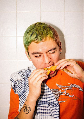
The brand needed character outside the logo itself. Adding illustration felt like the right move to make the brand feel more accessible, playful, and human.
Using illustration also gave me space to inject attitude in a more bespoke way.
Rather than relying on generic symbols or mascots, I could create custom assets that truly reflected the brand’s tone, cheeky, youthful, and a little irreverent.
To tie it all together, I designed a bold graphic pattern using elements I illustrated in Procreate. It brings energy, flexibility, and that punch of personality the brand was missing, while making everything feel cohesive across touchpoints.


New Logo


Rebranding
Dirty Bird
I chose to rebrand Dirty Bird because I thought the current logo was doing a bit too much.
Between the bright red, the script, the crosses, and the chicken head, it feels cluttered and a bit dated.
Dirty Bird has such a strong name on its own, I wanted to let that carry the attitude. The chicken illustration is fun, but it makes more sense on merch or packaging, not in the main logo.
The goal was to strip it back and let the brand feel bolder, cleaner, and way more confident.

1.
The first stage was about finding out more:
What is Dirty Bird at its core?
What’s working, and more importantly, what’s not?
I quickly uncovered that while the food had heat and soul, the branding didn’t reflect that. The existing visuals leaned on a typical visual language that somewhat reflects the irreverance of the name, but doesn't quiet nail it.
I identified a gap between the brand’s motto and message, and how it was being visually communicated.
Discovery & Brand Audit

2.
Through research, it became clear that having a chicken so prominent in the logo was too-on-the-nose and expected, but it would be good to implement that in a more general sense, such as in patterns for merch as well as across the restaurant and staff uniforms. So I made an illustration of a chicken head with brash brush strokes.
I also found that red is extremely common and doens't have a healthy amount of contrast against darker colors, so I thought an electric orange would fix that and bring an exciting level of irreverance.
Strategic Constraints
3.
Naming as a
Foundation
The name “Dirty Bird” became the springboard for the re-design.
It had bite, edge, and a cheeky tone.
Instead of diluting that with safe design choices, I leaned into the attitude.
The idea: treat the brand like a persona, one that’s bold, unapologetic, maybe even a little unhinged (in the best way).
From this base, I arrived to a conclusive design strategy and conceptual direction.


Visual Identity
For the visual identity, I wanted to lean on the irreverance and be literal about the "Dirty" part of the name, but give it an editorial edge to facilitate a super wide array of social media content creation and exposure amongst new audiences.


Illustration
The brand needed character outside the logo itself. Adding illustration felt like the right move to make the brand feel more accessible, playful, and human.
Using illustration also gave me space to inject attitude in a more bespoke way.
Rather than relying on generic symbols or mascots, I could create custom assets that truly reflected the brand’s tone, cheeky, youthful, and a little irreverent.
To tie it all together, I designed a bold graphic pattern using elements I illustrated in Procreate. It brings energy, flexibility, and that punch of personality the brand was missing, while making everything feel cohesive across touchpoints.


New Logo